First things first, before I get to the blog hop: MY WEBSITE IS UP AND RUNNING! Can you tell that I am excited? Just a little? ;) I spent a lot of long hours working on this little baby, so I would love for you to mosey on over and take a quick peak and let me know what you think. You can find it here or by clicking the “website” button on the menu bar.
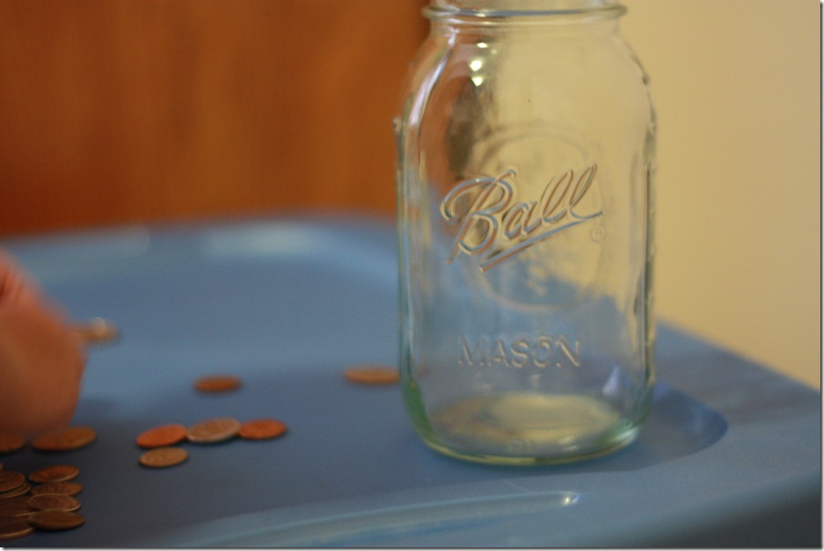
I took this the other day, inside, with horrible lighting, while Little Man was helping mommy “count change” and put it in a jar. We’re saving pennies and all of our loose change to put toward our trip to California in October. I had the White Balance on my camera set for Tungsten Light, but it didn’t really help the picture out that much. I hate indoor lighting. Bleh. Here is the before photo:

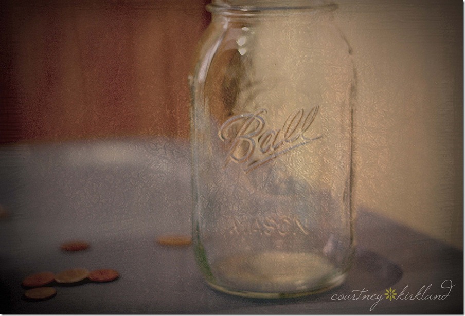
Horrible. Absolutely horrible. Nothing in the world about this photo that I thought could be salvaged. The only reason I didn’t delete it immediately is because I liked how clear the jar looked and wondering if maybe, just maybe, I could figure out something to do to it so that I didn’t have to totally get rid of it. I just downloaded the Trial Version of CS5 and hoped that this little beast could help me out. After much tweaking and playing around [even experimenting with textures!!] here is what I came up with:

I had to crop out Little Man’s blurry hand, adjusted the curves, applied a few different color filters and added a free texture that I found somewhere off of Google. I’m actually very proud of this one. I love the vintage look, and I’m considering framing it and hanging it up one day when we get moved. It looks like something that would go in a kitchen or something. And the Mason Jar has given me TONS of ideas for more photos. :) Head on over to Monica’s to see what everyone else has come up with this week!
Read more...


